


JOE MAYO
INTRODUCTION & SAMPLE IMAGE QUALITY COMPARISON

HOW I LEARNED TO STOP WORRYING AND LOVE GRAIN AND BLUR
I am not a pixel-peeper for the sake of peeping pixels.
I do it to make sense of my experience of an image. Then I work to implement those learnings in my own work.
I am not purely a technician. But I am a cinematographer and photographer with strong interest in the underlying technologies affecting my work. I’ve also entered a season of life in which I am hugely interested in how humans have harnessed the laws of physics to build the world around us (shoutout PBS Spacetime and Practical Engineering), and how we continue to do so. All that to say that while my photographic and cinematographic experience exceeds my technical knowledge of underlying sensor tech, I’m a quick study. And in the meantime, I absolutely stand on my ability to look at an image, learn about how it was made, implement those learnings into my own work, and communicate about those learnings with colleagues, mentees, and friends.
Aberration, distortion, field of view, depth of field, the transition from in-focus to out-of-focus elements, the size, density, and color qualities of ‘graininess’, the nature and directionality of light, the perceived distance of the subject to the camera; understanding these technical components is, for me, critical to assessing an image’s subjective qualities.
To date, I’ve leveraged this ability to “see” incremental differences between digital sensors or film stocks in order to make my own creative or business decisions about what products to use. Using that skill to help push image-making forward seems like an incredibly satisfying opportunity and a pivot worth exploring.
I appreciate your consideration and hope we get to chat more to assess fit for this unique role.
-Joe
P.S. Am I the only one who misses CCD grain patterns?

HOW I (GENERALLY) THINK ABOUT IMAGES
CONTRAST CURVE
How dense are the image’s pixels at a given exposure? How would you like to change that? Enter the image’s curves.
Manipulating an image’s contrast curve helps us to simultaneously fine-tune ‘local’ contrast and assess how those local adjustments impact contrast throughout the entire image. Personally, I think that’s a critical to keeping images detailed, pleasing, and ‘natural’ (if that’s the goal).
The beauty of curves is that we’re manipulating a vector-based interpretation of the image, rather than directly manipulating rasterized pixels. So, the changes made in curves more successfully port between similar, but not identical, images.
COLOR
Our perception of color might be an RGB cone retinal-lottery, but we can still make meaningful assessments of color when comparing two images. Especially if we work to make equal all or most of the other variables like viewing environment, color space, monitoring devices, etc.
I like to think about the color wheel. How can an image’s legibility increase by pushing the image’s adjacent ‘graphic’ elements toward two complementary (that is, opposite) areas of the color wheel?
Aspirational, trend-catalyzing images often do this. Recognizing the relational qualities of color in these images is key to replicating their style.
DOF, FOV, DISTORTION
We probably shouldn’t talk about Depth of Field without Field of View, and vice-versa.
My understanding is that nearly any format can adapt to produce nearly any DOF with a particular FOV, but the questions are: how far from the subject do you need to stand? And is the required theoretical lens aperture technically and commercially viable?
Still, different lenses on different formats are going to impart subtle differences in optical distortion and the quality of the transition from in- to out-of-focus areas, even if technically producing the same FOV at a given distance. When you’re considering how an image “feels”, that matters.
NOISE & GRAIN
A lot of images just need to be as clean as possible. A lot don’t.
Tastes change. Sometimes Instax cameras sell out or collect dust, sometimes CGI-clean is the way to go.
When trends do step away from perfectly clean images, we can leverage digital noise to emulate analogue grain to help the image to hit the right vibe.
How big are the perceived noise particles? How dense? How random are the variations in color?
When we do want super-clean images, being clever about all of this can also help to ‘hide’ noise with sleights of hand.
OTHER STUFF ABOUT JOE
The Minolta X-700 was my first stills camera.
The Pentax 645N is my all-time favorite stills camera.
There are two RED DSMC2 bodies in my kit; but I think everyone should be able to implement internal compressed RAW.
Ansel Adams’ The Camera is as useful for learning how to assess a scene today as it was in the days of celluloid, as far as I’m concerned.
Riding my motorcycle less now than in the past seems to have had no impact on the frequency with which I talk about riding my motorcycle.
I have, objectively, too many cameras, lenses, and lights.
I make a decent muhammara.
SAMPLE COMPARISON:
Field Imagery From Morocco In Two Formats
APPROACH & NOTES
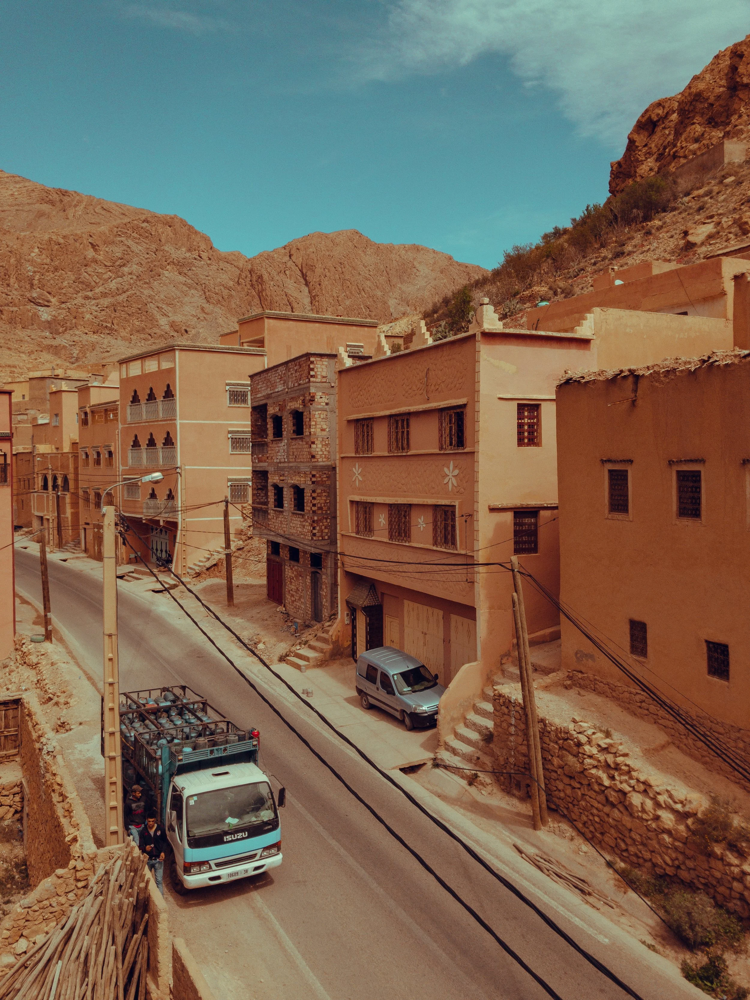
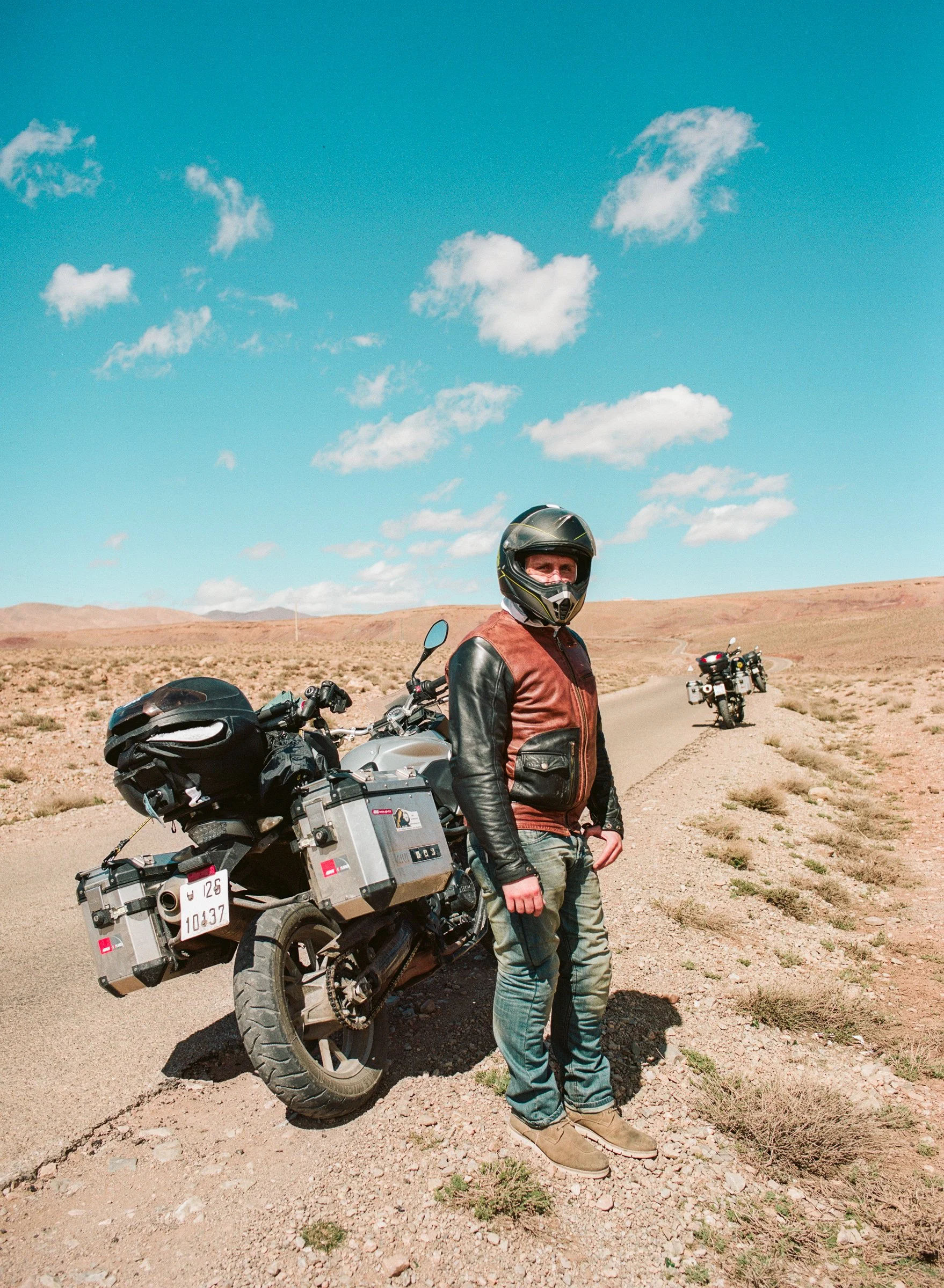
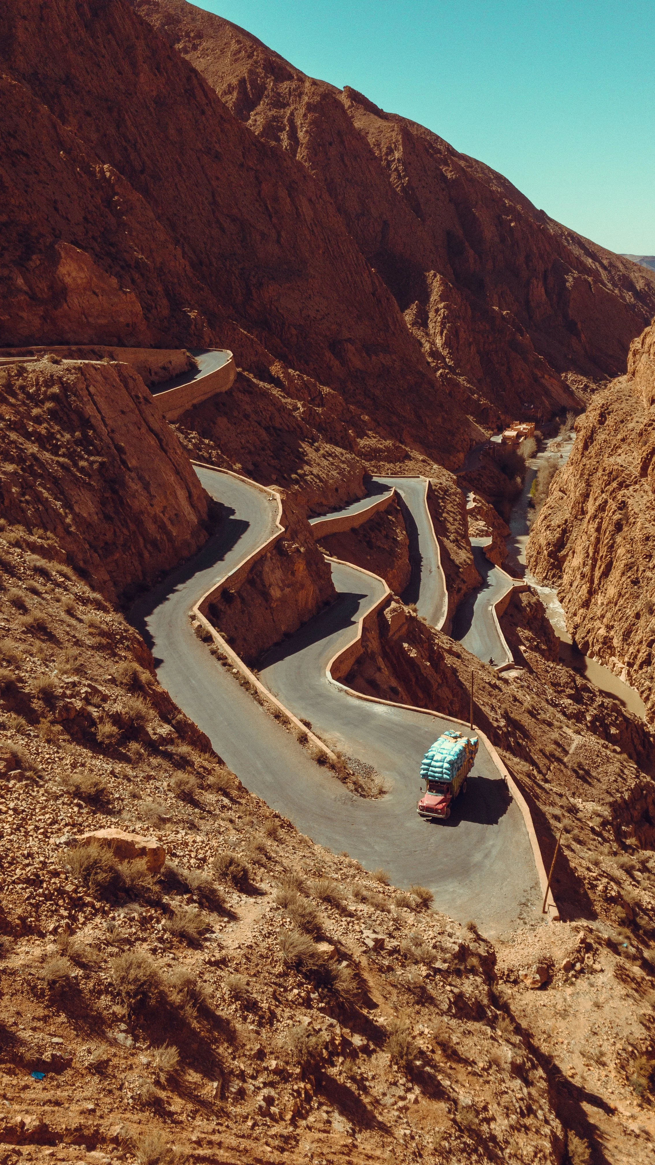
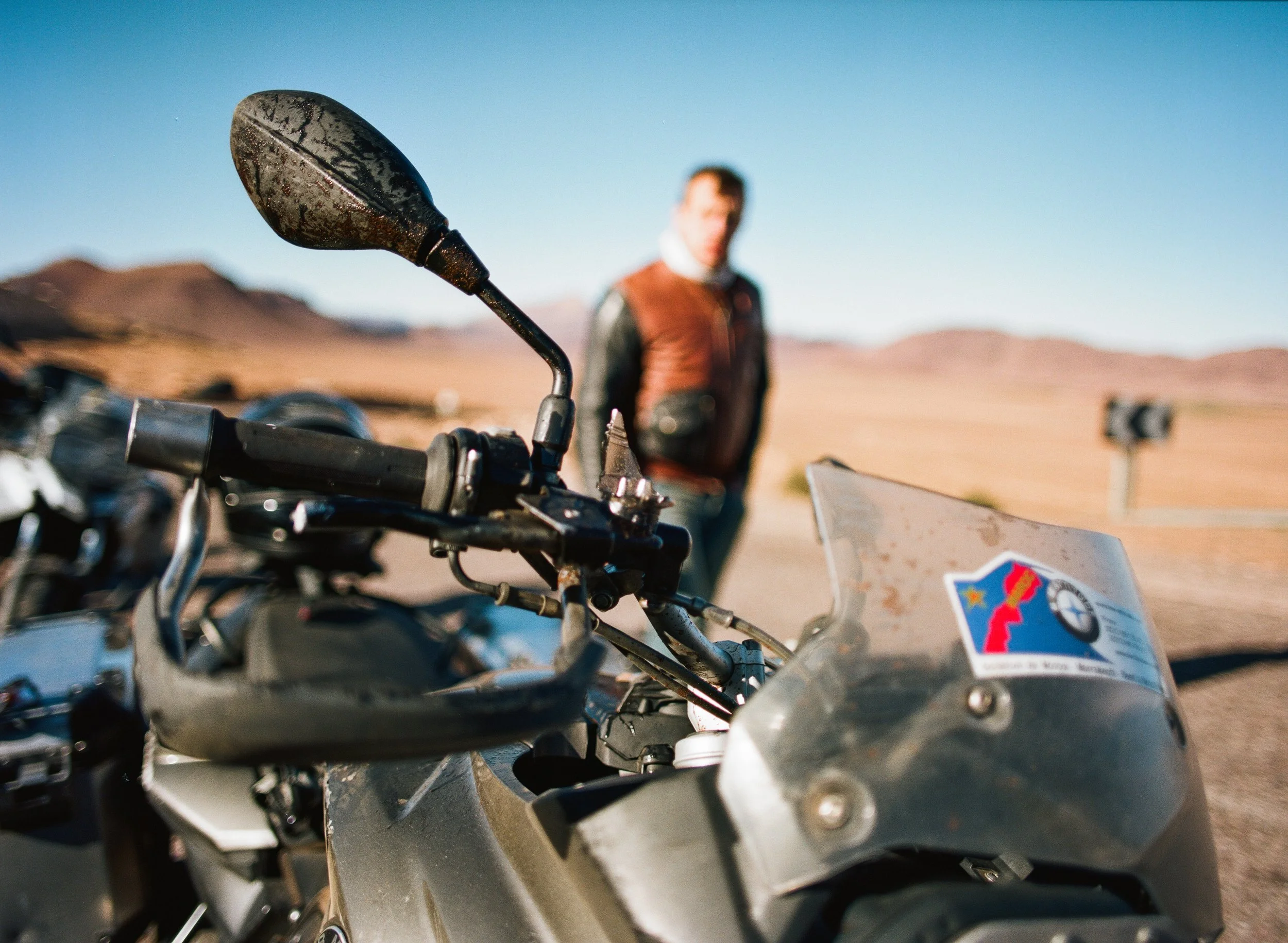
This site focuses on stills rather than video. You’ll see a series of images from a 2018 motorcycle trip in Morocco. This trip was special because I shot similar scenes in two very different formats: iPhone and 6cm x 4.5cm medium format film.
The goal was not to make one format look like the other. I just wanted the images to look cohesive enough so that they could appear together without feeling jarring (like at the top of this page).
You’ll see three sets of images with descriptions of what I see as their shared qualities and where I see differences that prevent them from looking like the same format.
This site is meant to give you a sense of my approach to assessing an image or set of images. It’s not a guess at the sort of work we might do together.
…also, in full transparency:
At the time of the trip, the only way to make RAW images on the iPhone was with Adobe Lightroom. So, all the iPhone photos were shot & edited in Lightroom. Yikes.
My intention is not at all to say ‘this is the best way to make images’, I just want to be honest about how I made these images. Thanks for your understanding!
In all of the descriptions to follow, I’m intentionally “eyeballing” the photos the way I would when editing photos for myself. For serious comparisons, I’d use tools like histograms, waveform monitors, and vector scopes.
Goes without saying, but it would be great to chat about these images in person while looking at the same monitor!

film
iPhone
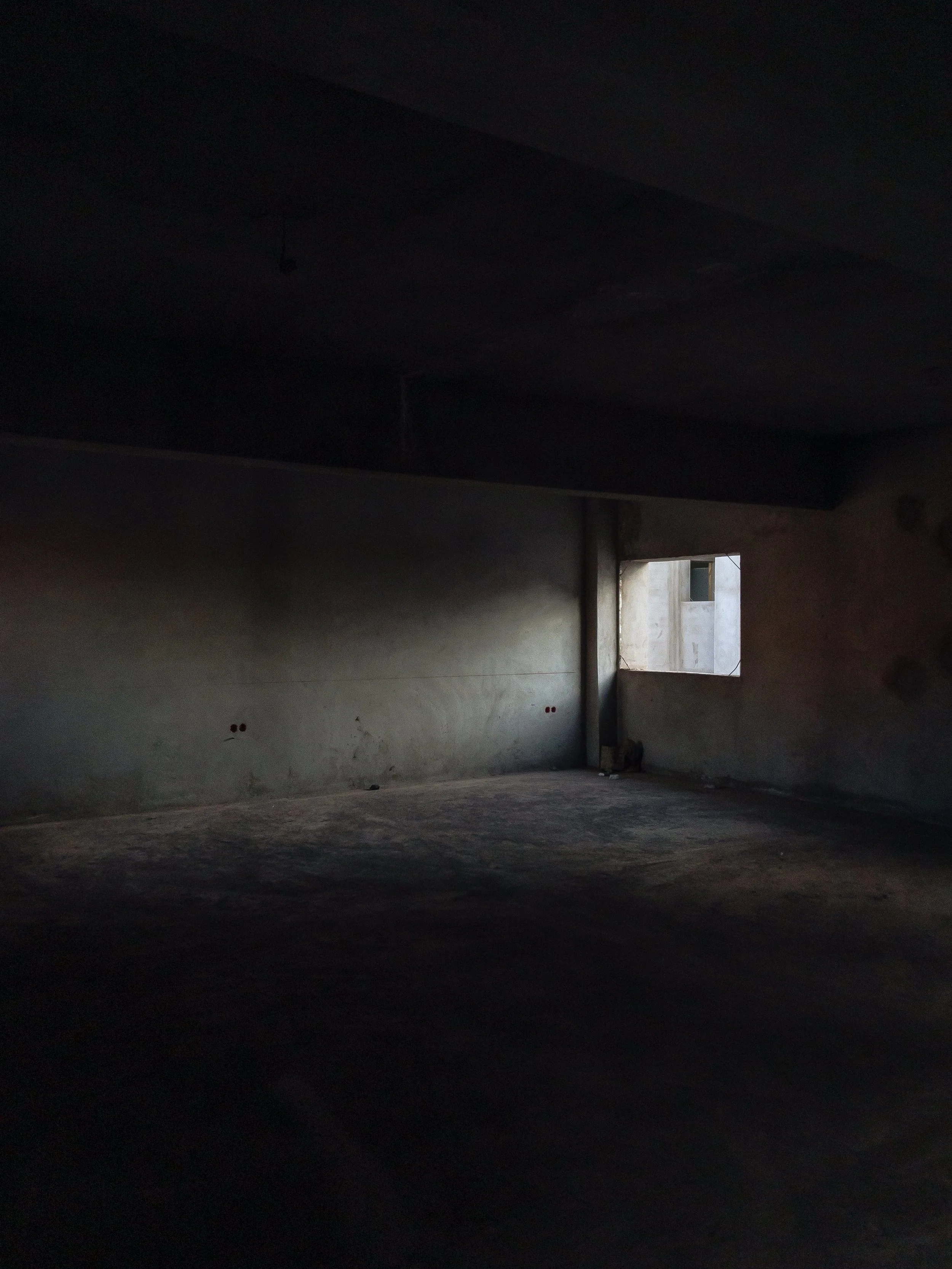
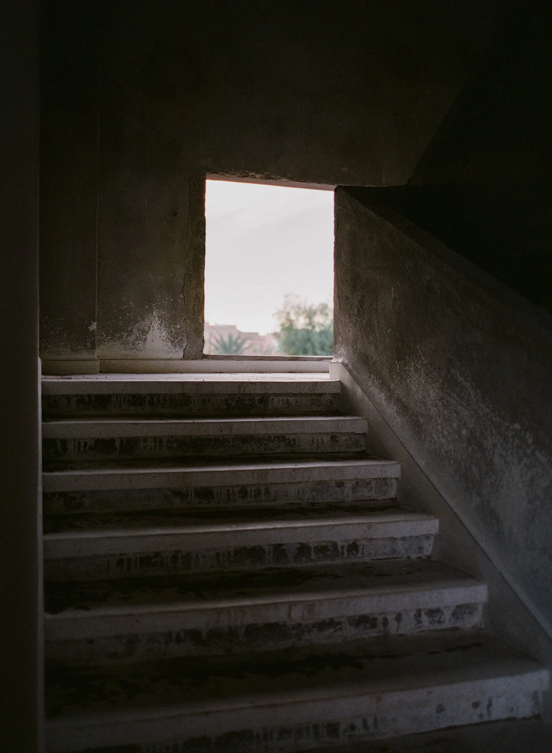
SUBJECT MATTER
Both of these images were made in the same construction site. Both images place a bright window in the middle of a shadowy concrete space.
The film photo’s window reveals a bright sky compared to the iPhone photo’s window revealing daylight hitting exterior concrete.
SHARED QUALITIES
Each photo’s exposure is adjusted to favor its bright window.
To some degree, both have nuanced shadows broken by subtle but graphic lines and even more subtle gradients. Neither photo’s shadows hit R0 B0 G0.
At these resolutions, grain/noise is relatively clean in both photos. FOV is similar, even if we can tell we’re standing much closer to the subject in the film photo.
Overall, these images are close to feeling like they could be a part of the same series, but not quite there.
NOTICEABLE DIFFERENCES
The iPhone photo’s shadows appear darker and bluer than the film photo. Overall, there’s a faint green cast on the film photo. The color transition from blue shadows, to reddish mid-tones, to greenish highlights is more subtle on film than in the iPhone photo.
The film photo exhibits shallower DOF and the iPhone photo feels sharper overall.
The film photo exhibits a little color fringing where the dark window meets the bright sky, characteristic of older lenses, especially on color film. The iPhone photo lacks this minor but noticeable effect.
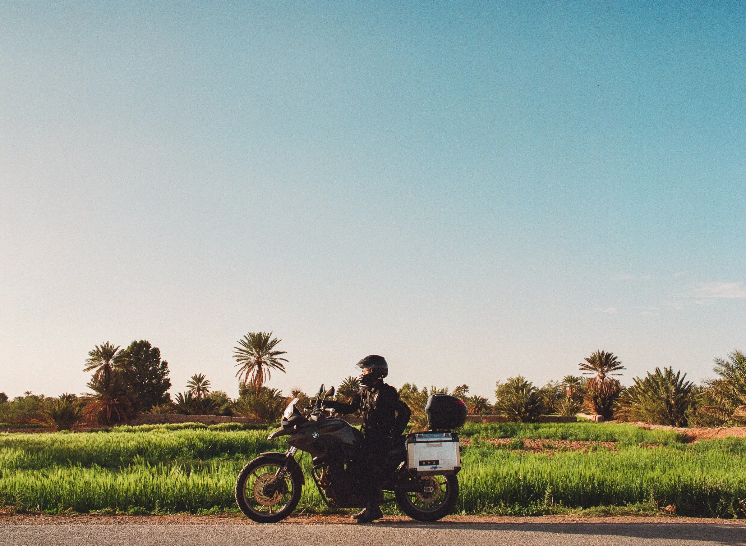
film
iPhone
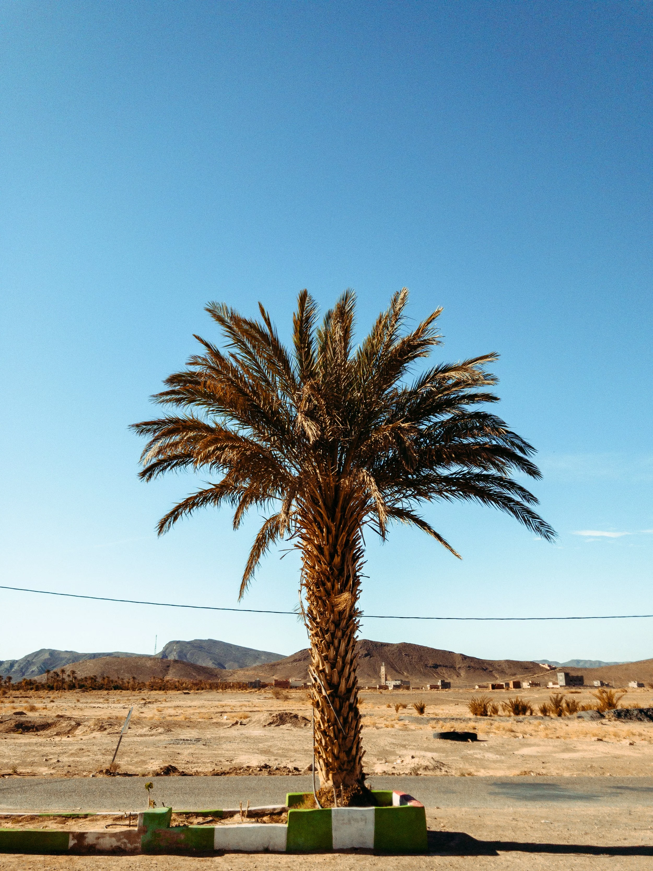
SUBJECT MATTER
These are two photos shot outside, late in the day, with cloudless skies, along the side of the road. The main light source in each is coming from left of the frame.
The lighter ground below the subject in the iPhone photo seems to be providing a little more fill/bounce light compared to the pavement in the film photo.
Both photos contain palm trees.
SHARED QUALITIES
Overall exposure is very similar, but the iPhone feels a bit brighter.
Both exhibit relatively deep focus suggesting a small aperture. FOV feels similar in each.
In both, a lack of motion blur in the grass or on the palms suggests a relatively fast shutter speed.
Both images feel quite clean.
Most of the color feels similar. The palm trees in both photos share similarly red-yellow trunks and red-green palms.
NOTICEABLE DIFFERENCES
The iPhone photo’s sky is much less cyan. The film photo’s sky subtly transitions in hue from cyan to a pale pink.
In the iPhone photo, there’s a cyan/blue fringe around the palm leaves against the lighter sky; where the rider’s helmet meets lighter sky, there’s no fringe.
In the iPhone photo, shadows are darker and overall contrast is higher. The film photo feels a bit washed out due to raised shadows with low detail.
There is a bit more grain in the film photo.
The iPhone photo is a bit sharper overall.

film
iPhone
SUBJECT MATTER
These are a couple of roadside photos looking a relatively long distance to the background landscape, with strong leading lines drawing focus to the subjects.
Light is soft in the film photo due to it being taken during ‘blue hour’ just after the sun has dipped below the horizon.
Light is soft in the iPhone photo because the afternoon sun is behind a layer of clouds.
The iPhone photo is slightly back-lit and therefore more shadow-filled.
SHARED QUALITIES
Considering these are totally different formats, the grain feels quite similar in both at this resolution.
Shadow details and shadow color is quite close; blue sections of sky are close in color, but with different luminosities.
Subject sharpness feels close, too.
NOTICEABLE DIFFERENCES
Overall exposure feels lower in the iPhone photo.
In the iPhone photo, the red channel is overly boosted and red hue is pulled too much toward orange resulting in unnatural transitions from reddish terrain to more yellow terrain compared to the film photo.
The aperture feels larger and DOF is lower in the film photo. The closest ground is beginning to fall out of focus and the deep background is out of focus.
Meanwhile, the closest elements in the iPhone photo are barely softer than the distant riders. This is partially a function of the focus point being further away (DOF increases with focus distance), and partially a function of format.

The photos in each of these pairs arguably look “pretty close” to one another, but there are plenty of differences that could be addressed to make the photos look more cohesive. Juxtaposition provides a visual baseline for multiple observers discussing improvements, rather than only providing feedback on isolated photos.
Contrast, dynamic range, hue, and saturation were all significant differences. In particular, the relationships of hue and saturation to luminosity were more dynamic in the film photos. There, highlights and shadows tended to be less saturated while mid-range luminosities remained saturated.
Subtle differences in DOF were also apparent, even in these generally wide-angle and backed-off photos. This should not be a surprise given the dramatic difference in size between the two formats’ image areas.
In the film photos, there are technical ‘deficiencies’ that crop up in certain situations, but not in every photo. Think of the color fringing in the construction site. That’s the sort of detail that gives a lens or format a sense of character. Of course, the magic of cleanly-captured digital images, like those on the iPhone, is that this character can be emulated or altogether changed later.
I don’t mean to suggest that the next great iPhone camera mode is “6 x 4.5 Film.” But I do think that this approach to examining component photographic elements that ladder up to character, vibe, or look is useful for assessing any format or style within a format, in stills and in video.
As image-makers, often we receive feedback from folks or users who are only able to express how an images feels. It’s up to us to sort out how the technical details of an image influence those feelings in order to respond to that feedback.
Truly, I don’t know whether this sort of observation has anything to do with the job as described. But I hope this site provided some insight into my observational skills today, and whether those skills might add value to the team.
THANK YOU, AGAIN.
I’m looking forward to learning more about the role, what you are looking for, and whether my profile might be the right fit.
Joe Mayo
joe@idlematter.com
www.joemayofilm.com
www.idlematter.com
717.818.4069